I Like It Fast And Italian

The Art of Speed and Style: A Look at ‘I Like It Fast and Italian’ Graphic Design
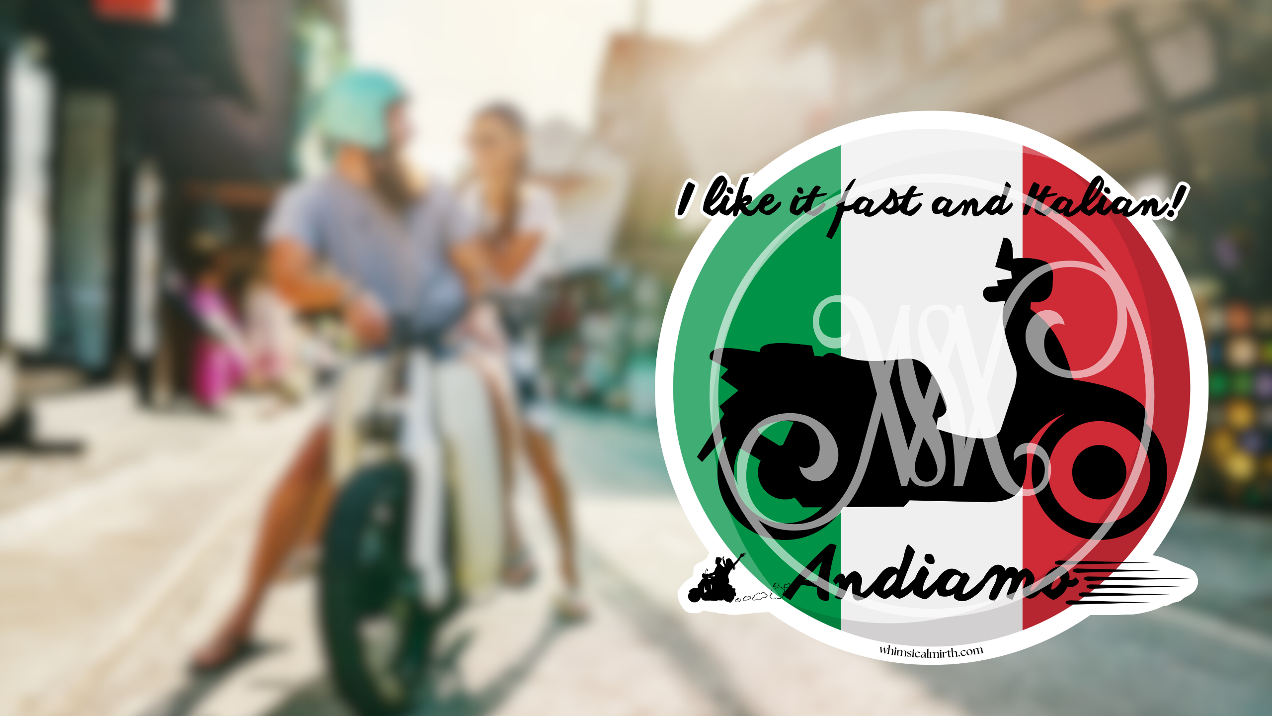
Few designs capture the essence of speed, style, and cultural flair quite like “I Like It Fast and Italian.” This striking graphic features a bold circular Italian flag with a sleek black silhouette of a scooter superimposed over it. Complementing the design are the playful yet passionate words above, “I like it fast and Italian!”, and the inviting Italian phrase, “Andiamo,” meaning “Let’s go!”. This graphic masterfully blends national pride with the thrill of motion, making it a standout piece for enthusiasts of both Italian culture and classic scooters.
The Design Breakdown
The composition of this design is carefully crafted to maximize visual impact. The circular shape of the Italian flag provides a strong foundation, symbolizing unity and timelessness. The classic tricolor—green, white, and red—immediately conveys a sense of identity and heritage, grounding the design in unmistakable Italian culture.
At the center, the black scooter silhouette offers a bold contrast against the vibrant flag colors. The scooter, an icon synonymous with Italian streets and effortless cool, exudes movement and freedom. Its solid, minimalistic design ensures immediate recognition, while also leaving room for imagination—this could be a vintage Vespa, a sporty Piaggio, or any other classic Italian ride.
Typography & Message
The typography plays an essential role in reinforcing the theme. The phrase “I like it fast and Italian!” is presented in a stylish, slightly italicized script that mimics speed and excitement, creating a sense of movement within the words themselves. The informal, playful nature of the phrase adds an element of cheeky enthusiasm, making it an engaging and memorable statement.
Below, “Andiamo” is written in an elegant, flowing script that complements the energy of the upper text. This word choice not only reinforces the Italian theme but also acts as an invitation—urging viewers to embrace adventure and motion.
Why This Graphic Works
- Strong Visual Identity – The Italian flag provides an immediate cultural connection, while the scooter silhouette enhances the theme of speed and style.
- Balanced Contrast – The black silhouette against the tricolor background creates a sharp, engaging contrast that makes the design pop.
- Emotional & Playful Messaging – The combination of English and Italian phrases adds personality, making the design accessible yet authentically Italian.
- Versatile Appeal – This design is perfect for lovers of Italian culture, scooter enthusiasts, and those who appreciate dynamic, well-crafted typography.
- Minimalist Yet Impactful – A simple composition ensures easy recognition and adaptability across different mediums, from stickers and apparel to digital applications.
Conclusion
The “I Like It Fast and Italian” graphic design is a brilliant fusion of national pride, timeless aesthetics, and the exhilarating freedom of motion. Its bold use of color, contrast, and typography ensures a lasting impression, making it a perfect piece for those who share a love for all things fast, stylish, and undeniably Italian. Whether as a sticker, apparel design, or digital artwork, this graphic is an open invitation to ride in style and embrace the passion of Italian culture.
Stay tuned for more in this dynamic series, where design meets humor, heritage, and speed!
Customize and Order Now!
Get this graphic design on stickers, t-shirts, hoodies, and other everyday accessories at RedBubble!
